

The past 14 days we had real spring in Belgium. Some days we had 20° C (68°F) !This gave energy to create in different ways...
I created in the enveloppebook of Jenny. Her theme is all about fashion : dresses,shoes,... She especially love images of the beginning of 1900, so I decided to make something in my style that she (hopefully) will love.

I've been following the online class of Tim Holtz "creative chemistry" the past 14 days too. I especially loved all the "chemistry" he explained that is involved in the different products he uses.
Although I already knew all the techniques he teached, the class was still a revelation for me because of the knowledge, the tips and tricks he gave.
The class is over, but people can still sign in here, whenever they want and view all the videos. The PDF's are such a great resource to go back to when you start to create and make his techniques " your own".
On the pages I used the wrinkle free distress technique. One thing I also learned on this class is that I can use much more different distress colors on one page and that they still coordinate !
The page was a bit too bright for the images I wanted to use. I used gel medium and a stencil from the craftersworkshop to make also more texture. When the gel medium was dry I overinked everything with purple distress ink.
This toned down the bright background but through the gelmedium different colors still could pop up.

I stamped "tiny bridesmaid" from Stampington (one of the first stamps I bought years ago...) with permanent black ink on white paper.
The white was not good: a too big contrast with the background and the kind of image I was using.
I colored the paper over the inked image with "antique linen" distress stain. The dress and the ruler were colored in with distress stains and a waterbrush. The edges were finished off with vintage photo distress ink.
I added 4 vintage buttons from my stash on the corners and glued the image on the left side of the page.

There is a flap on the right page and some of you who's been here before know what's behind... Something is hidden...
I used another technique here to cover the bright background. I stamped with embossing ink and embossed with clear embossing powder. Overinked everything again with purple distress ink.
The medaillon is a photostamp of oxford impressions, stamped with permanent black ink and three times embossed with UTEE, so it looks like a enameled plate.

When you lift the flap : here you see what is hidden...
A pop-up of two vintage ladies. I used several stamps of oxford impressions and of crafty individuals ( the poppy stamp) , another great vintage stampdealer, but this one is from the UK.
I also used the lace border of Tim Holtz as a decorative element in the pop up.

Here you can see the big and small tag that houses in the enveloppepockets on the left and right.

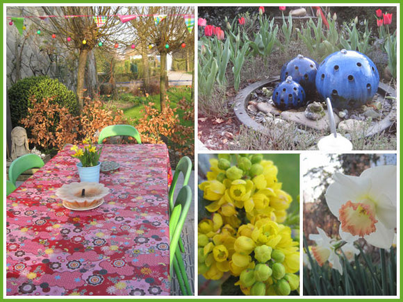
To prove spring arrived in Belgium, look at these beauties... Wild pansies in my garden.. I love how they find their way in my garden and start spreading out...

The weather was so good, we could sit in our gardenchairs on the wooden terrace . We were not the only ones...
As soon as I left my chair, one of the six cats took my place, so I ended up putting more gardenchairs so they had a sit too...or at least I had a seat when I didn't had the guts to get the cats move...

The weather has even been so good, we could grow cats in our plantpots...
This seemed the perfect sunny spot for our old cat "Red Zita"...
We could even eat twice a day outside..
The waterfountain is bubbling water and in the garden several springflowers are starting to bloom and give color in the green garden.
I renewed my little flags in the garden. I always have flags in the garden. I love it to see how the wind plays with the colorful flags during the several seasons.
To complete the fun I went to Ikea and bought three strings of lights ( with sunenergy) so even at night our garden looks colorful and happy.
Yes, I am happy :)
Inge


Reactie schrijven
teri f (maandag, 02 april 2012 02:08)
I love your blogpost, Inge. Purple is the color now! My husband's family is from Belgium - have i ever mentioned that? I think they are from the Brussels area, originally.
Kathy (vrijdag, 06 april 2012 12:57)
Inge,
I just visited your blog and all I can say is... I so desperately wish I could come to Belgium to visit you!
Each section of your blog is so beautiful. I feel as though I am looking at a wonderful coffee table book that is filled with magic and wonder! You have a very creative editing eye!
Inge, in the section for your home, you have a beautiful sea foam green wall with a stencil inscription. I would love to know the English translation if at all possible. Your home is so magical with a wonderful sense of whimsy. Your home perfectly reflects your artistic style.
In the section for your store, I did not see any photos. Will photos be available soon? I guess that I will have to have my Belgium travel experience through your blog.
Thank you so much for sharing.
Kathy
Terrie (zondag, 08 april 2012 09:52)
Your book for Jenny is gorgeous Inge! Love the pop up!
Terrie